top of page
Dave Mearsheimer
BRANDING


76% of Users
Opted for high contrast and simplicity, informing the final design aesthetic
2-Month Design Phase
The time it took to create the final branding and brand kit.
.png)
3 Sponsorship Meetings
Secured within the first week of the new brand launch.
Sub Text chosen to be subtle and appeal to sponsors for exclusivity at a higher standard.
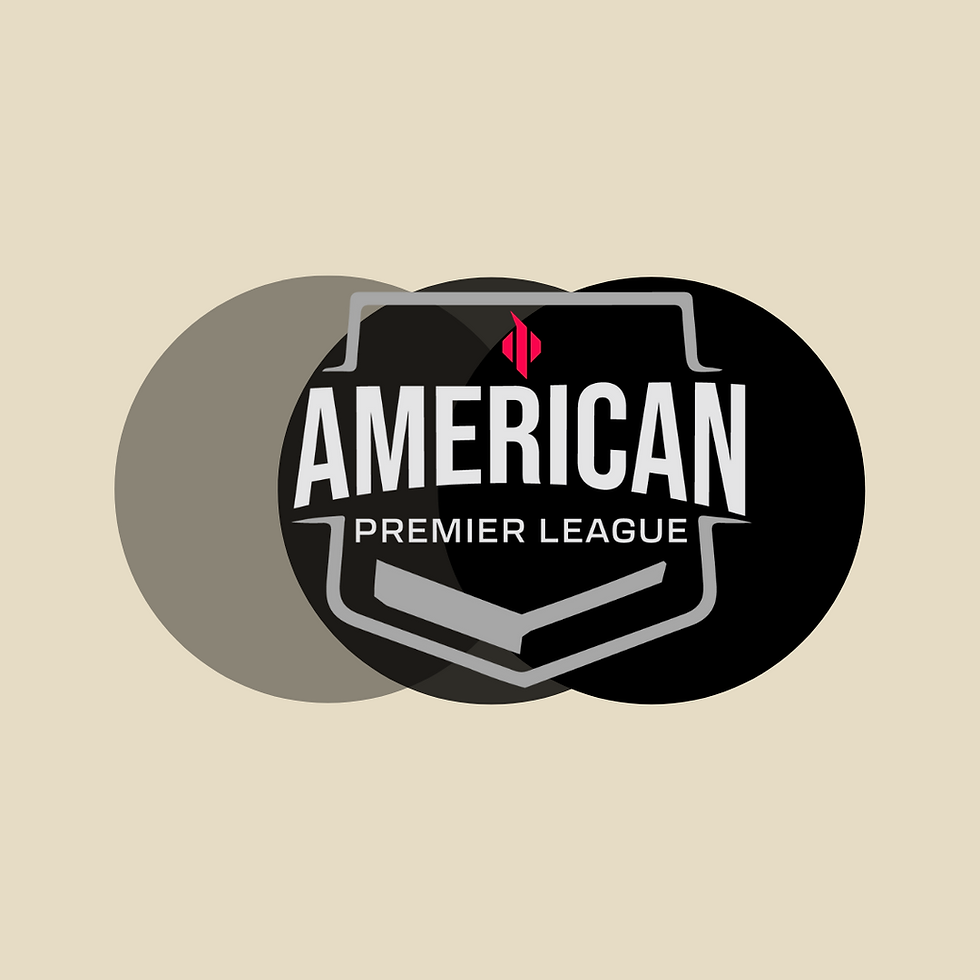
Shield/Crest chosen for both physical branding and to amplify the feeling of tradition.
Submark
Font chosen to be bold and legible at all levels as well as.... American!
Built on a grid system
SUBMARK DESIGN
2024
American Premier League
Freelance
Project Type
Designer | Developer | QA | Stakeholder
Role
Visual Designer | Motion Designer | Graphic Designer
Tools
Adobe Illustrator | Adobe XD | Figma | Adobe Photoshop
Contribution
Designer | Developer | QA | Stakeholder
bottom of page